Pages

December 29, 2017

Home for the Holidays - Scrapshotz Design Team

Hi there!

I hope you had a lovely Christmas!

Today, I am up on the Scrapshotz blog showcasing two layouts made with Kaisercraft's Mint Wishes. One page is very Christmassy and the other is not at all!


For all product information and details on the layouts, be sure to check out Scrapshotz.

Thanks for looking!
Sylvie

December 20, 2017

Merry & Bright - Scrapshotz December Design Team

Hi there!

I'm up today with a couple of layouts that I made for Scrapshotz with the beautiful Kasiercraft Mint Wishes.

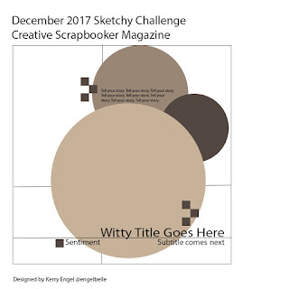
This month, we are using the December sketch from Creative Scrapbooker Magazine.  When I saw the sketch I thought of Christmas ornaments.  I used my Silhouette and a cutfile from Lori Whitlock to cut the ornaments.


I embellished each of the ornaments with Nuvo Crystal Drops and glitter. And I made the Thicker alphas look wintery by inking the edges of each letter and sprinkling them with white acrylic paint.


For the next page, I started by using Nuvo Embellishment Mouse and a Tim Holtz stencil in the top left corner and where I wanted my photo.  The mousse is a pretty cool product which gives a a shimmery texture. The rest of the page is pretty simple, just decorated with the stickers and die cuts from the kit. 


Be sure to check out the Scrapshotz blog  for all the details and for links to all the products.

I'll be back in a few days with a couple more pages!

Thanks for looking!
Sylvie

December 4, 2017

Reindeer Training Academy

Hi there!

At this time of year, I don't have much time to scrap because I am usually working on Christmas crafts.  This is what I made this weekend.


I saw this project on the Lori Whitlock blog and knew I had to make my own. I have had this piece of mdf board in my stash for years.  It's 12x16 inches which was the perfect size for this cut file.

I started by painting the background with dollar store white acrylic paint and letting it dry. The cheaper the paint, the easier it is to distress later. 


I cut the "Reindeer Training Academy" cutfile from vinyl.  For these types of projects, I choose to save my Silhouette vinyl and use mac tac from a home improvement store. I just change the cut settings on my Silhouette to cut a thinner vinyl, but it works just fine.


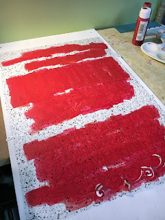
Using a makeup sponge,I dabbed the red acrylic paint over the vinyl stencil. I like using a makeup sponge with a stencil as it helps reduce the amount of paint I use and I'm less likely to have bleeding under the stencil.  I drug the makeup sponge along each edge of the board to give it a frame.


Once the paint was completely dry, I removed the vinyl and using a sanding block, I sanded off some of the paint. I moved the sanding block in a vertical motion only to give it a worn look and sanded some areas more than others so it wasn't even. I did extra sanding around the edges so the wood could show which created the distressed red and wood border.

Since the mdf board was only 3/8" thick, I used my Crop A Dile to punch holes in the upper corners, threaded some leather ribbon and viola!  A Christmas wall hanging.

I just love it!  It looks great on my orange living room wall. 

Thanks for looking!
Sylvie

November 25, 2017

Just our Luck and Explore Holguin

Hi there!

I'm up today with another couple layouts for my Cuba vacation album.  I have just a few pages left to do in this album. Have to say, I'm starting to look forward to working on something new.


In the interest of getting this album finished, the pages are pretty simple. The papers are from Shimelle's Go Now Go and collection.

On this next page, I used some  black paint and mist to distress the background and embellished the page with some die cuts from Crate Paper Journey and some Silhouette cut files from Lori Whitlock. I dug through my stash to find the car stamp, which is a very old Studio Calico stamp. I think it's so cute!


I had been saving this map paper from Go Now Go for these photos. The colours matched perfectly with the buildings in the photos. Since I had so many photos and the paper was so busy, I mounted them on a piece of white tissue paper.  You can still see the background pattern, but it gives the photos a place to rest.

The page is embellished with Go Now Go diecuts and stickers and some very old rub-ons from Marah Johnson.

I would love to get this album finished before December so that I can concentrate on December Daily.  Not sure if I'll be able to accomplish that feat, but I am gonna try!

Thanks for looking!
Sylvie

November 20, 2017

Who Took it Best?

 Hi there!

A couple of weeks ago, I took part in the challenges over at the Paper Issues Facebook group.  It was a lot of fun. I only got two pages done, but I'm pretty happy with what I created.

The challenge for the first page was done on Facebook Live and we had to create a page at the same time as the designers.  Sort of like "Simon Says".  I just love the result!


Everything is from the Crate Paper Oasis collection and the title was made with Thickers and Simple Stories stickers..

The next challenge was to make a page using lines on your page. I created this background with very old Crate Paper washi tape and paper strips from many manufacturers that came from my scrap pile. The page is embellished with some older Crate Paper Pier and Oasis embellishments.


Challenges really do help me get pages done quickly. And while on-line crops aren't as fun as the real life crops, they sure can challenge me to step out of my comfort zone.

Thanks for looking!
Sylvie

November 13, 2017

Let Your Crazy Shine Bright - ScrapShotz November Kit

Hi there!

I'm up on the ScrapShotz blog today with a couple of layouts made with the November Kit featuring the beautiful Prima Marketing Amber Moon collection.


Both of my pages were inspired by sketches from Creative Scrapbooker Magazine and Stuck?Sketches and made entirely from the November Kit. There are a ton of embellishments in this kit, so it made making the layouts a breeze.

All the details about the layouts are on the ScrapShotz blog.  Be sure to check it out!

Thanks for looking!
Sylvie

November 3, 2017

So Grateful For You - Scrapshtoz November Kit

Hi there!

I'm up today with a layout made from the beautiful ScrapShotz November Kit. It's a beautiful kit and my projects came together so quickly.

For all the details and instructions for each product, be sure to check out the ScrapShotz blog.


Thanks for looking!
Sylvie

October 30, 2017

2017 December Daily Flip Album - ScrapShotz Design Team

Hi there!

I'm up on the ScrapShotz Blog today with my 2017 December Daily album featuring Lawn Fawn Perfectly Plaid paper and The Ton stamps.


I only made the dedication page for the album.  I like to wing it as I scrap and don't want to be tied to any design.


I also dipped my toe in making a video showing how the album works. 


It was a lot of fun to make this album.  For the instructions, be sure to check out the ScrapShotz Blog.

Thanks for looking!
Sylvie

October 23, 2017

The Ton Stamps for Scrap Shotz

Hi there!

I'm up today with my projects for the Scrap Shotz Design Team.  This month, I got to play with some The Ton Stamps sets. This is a new to me stamp company, but I just loved them.  They are so detailed and I can see that they will be a staple in my stash.

I created three cards with the stamps and the images were coloured with either watercolours or Copic markers.  Be sure to  check out the descriptions for how I made them on the Scrap Shotz blog.


Thanks for looking!
Sylvie

October 13, 2017

Oh happy moments with you

Hi there!

Today, I am sharing a layout inspired by the Creative Scrapbooker Magazine October sketch.


I've had these photo frames in my stash for years. I think they are an old Two Peas in a Bucket free cut file. Many times if I am cutting an image from a multi image file, I will cut the extra items just to have on hand.  These were cut out of white cardstock but the white didn't stand out from my background paper.  So, I coloured them with Distress Oxide Ink in Worn Lipstick and Cracked Pistachio and Hero Arts Shadow Ink in Stone Wash. All the embellishments are from Crate Paper Oasis and Carousel. 

This page came together for me very quickly - only a couple of hours.  That's almost a record for me!

Thanks for looking!
Sylvie

October 7, 2017

Guardalavaca Beach

Hi there!

I'm up today with a mixed media layout featuring Infusions Coloured Stains from PaperArtsy.


The coloured stains are pretty fun to use.  They are made up of dye colour pigment with small amounts of walnut stain mixed in.  They are water soluble and can be used in many different ways: stamping, stencils, watercolouring, etc. 

For this page, I sprayed the background page first, then sprinkled the Infusions in Olive Tree and Green Man.  The minute the powders hit the water, they start to dissolve and the colour blends.  The walnut stain dissolves more slowly, but to control the brown colour, I heated the solution with my heat gun.  If you want a darker colour, you can add more water and powder.

I didn't have an infusion in blue, so I added a bit of Gelato in Boysenberry and Blueberry mixed with water. It blended very well with the Infusions.

Once the background was complete, I started layering some very old Glitz Design papers under the photo and embellished with some very old Paper House chipboard and some new Carta Bella Transatlantic diecuts. You know I love mixing new with old!

As usually happens with mixed media, most of it is covered up with the photo and embellishments, but I love the effect of it just peeking out.

Thanks for looking!

Sylvie

September 30, 2017

Sneaky Selfie

Hi there!

Today I'm sharing another vacation layout mixing Crate Paper Oasis supplies with older items from my stash.


I started this layout with the page design in my head.  The dark blue towel in the photo was my nemesis trying to pick a background.  In the end, I went with a neutral kraft paper and some torn paper strips.The pink background stamps are an old Studio Calico stamp and Worn Lipstick Distress Oxide inks.  The title is cut using my Silhouette.

Once the background was done, the rest of this page came together very quickly.  The very old chipboard  umbrella is from the Crate Paper Pier collection. Since the flamingo is gold, I felt like I needed some gold in the opposite corner.  But, I didn't have anything that would work in my cluster.  That's when I had the idea to gild the umbrella with some extremely old foiling kit from We R Memory Keepers.

The date on the package says 2008, so I wasn't sure if it would still work, but it worked like a charm! I think the Duo Embellishment glue was from the same kit and it wasn't even dried up. ;)  I painted the glue onto the the chipboard using a small paintbrush then let it dry until it became tacky.  Then I placed the foil sheet over top and rubbed to adhere the foil. 


As you can see, it's a little bit splotchy, but I might not have left the glue to sit long enough.  I was really anxious to see if this would even work.  HA! I'm pretty happy with how it turned out. The gold looks better in real life. I'm thinking that maybe I should have done the entire umbrella in the foil, but it's done now. And I never go back and redo something, so it's going in the album as it is.


I really love this page.  Now, I'm looking around thinking what else I can foil.  ;)

Thanks for looking!
Sylvie

September 21, 2017

Pizza in the Sun

Hi there!

Today, I'm stash busting some old Fancy Pants paper and embellishments and using the Creative Scrapbooker Magazine September sketch as the inspiration for my page.


When I started this album, I made a kit from Crate Paper "Oasis" and Fancy Pants "Beach Bum" and "Beach Babe". I 'm trying to get the papers I like into my albums and out of my stash. This sketch allowed me to use up quite a bit of paper.

I started with a cutfile from Paper Issues and backed it with Fancy Pants paper. I started embellishing the page with the glitter embellishments and buttons also from Fancy Pants, but my kit didn't have any journaling cards that worked.  I was pretty happy when I realized that the colours of Shimelle Laine's "Go Now Go" collection worked quite well with these papers.

There are no techniques on this page. Just basic scrapbooking. But, I love it a lot.  It's so bright and cheerful. And I made quite a dent in the Fancy Pants kit. YEAH!

Thanks for looking!
Sylvie

September 16, 2017

Baby Cuban Pineapple

Hi there!

Today I am sharing a fun layout featuring a large die cut and the Crate Paper Oasis line.

When I saw this free diecut from Paper Issues, I knew exactly what I wanted to do with it.


I cut the file using craft cardstock and backed the top with the green paper.  The cutfile was supposed to look like the image below, with the cross hatching. But, I wanted to use up some scraps of patterned paper and use my newly purchased fringe scissors.  So, using my craft knife, I cut out the cross hatches.

I cut each strip of patterned paper with the fringe scissors before gluing everything together into a large square. I sewed gold thread through each strip.  Then using some wet adhesive, I glued the die cut over the fringed square and finally cut around the shape. I did have to glue some bits of fringe that fell off, but surprisingly, that wasn't too much of an issue.

I used clear gesso on the background page and smooshed some Distress Oxide inks in Broken China, Worn Lipstick and Fossilized Amber. I then took a deep breath and stamped directly on the background with the Emerald Creek camera  stamp from the Scrap Shotz September Kit. What a pretty stamp!

I love how this page turned out! I seem to be using these large diecuts a lot in this vacation album, but they really make an impact. I already have a few more pages floating around in my head!

Thanks for looking!
Sylvie

September 6, 2017

Scrap Shotz September Kit Reveal

Hi there!

I am excited to be sharing the projects I created for the Scrap Shotz September 2017 kit. This month, the kit is based on the Carta Bella Transatlantic Travel line.  This collection fit perfectly to scrap an excursion we took on our trip to Cuba.


For all the details on how I made these layouts, be sure to check out the Scrap Shotz blog.

Thanks for looking!
Sylvie

August 25, 2017

Fifteen Two Fifteen Four

Hi there!

I have a fun but simple layout to share today with the Maggie Holmes Carousel collection.


I started with the woodgrain patterned paper to match the crib board.  In my stash, I found a piece of Maggie Holmes paper with the blue dots which reminded me also of a crib board.  So, I cut it in the shape of our board and the rest just fell into place.

The title was cut from my Silhouette and most of the embellishments are also from Carousel. I did pull out some very old Making Memories rubber stamps to make the heart, spades, diamonds and clubs label. And to simulate the cribbage pegs, I found some stick pins and added some flags.

This page just makes me smile.  And makes me crave a pina colada.  ;)

Sylvie

August 19, 2017

Horse & Buggy Tour


Hi there!

I'm up today with a double page spread using lots of mixed media and lots of layering.


I started by applying white gesso on the cardstock with my fingers. I like using my fingers because it gives a more textured look than applying it with a brush. When it was dry, I used the "smooshing" technique to add some colour with  Distress Oxide inks in Fossilized Amber, Worn Lipstick and Faded Jeans. As often happens, the papers pretty much hide all my hard work, but there are hints of it that show on the edges.

Once again, I am using the Crate Paper Oasis collection mixed together with some older Pink Paislee Atlas paper.  The title is inspired by a layout from Cat Martin, and stamped using the Oasis alpha stamps and some Thickers. The rest of the layout is embellished with Oasis ephemera and chipboard, some Crate Paper Journey, Tim Holtz Small Talk stickers, Shimelle enamel hearts and miscellaneous rhinestones.


The last step was to sprinkle some gold on the pages with some Heidi Swapp Colour Shine.

The page is pretty warped because of all the mixed media and it looks crooked in the photos, but it is straight in real life.  The warping doesn't really bother me, unless I'm trying to photograph the layout. It drove me crazy trying to edit these pages to be straight. In the end, I gave up. ;)  Once the pages are in the album, the warping doesn't show.

Pretty happy with how this layout turned out.

Thanks for looking!
Sylvie

August 11, 2017

Birthday Dinner by the Sea and Scrap Shotz Design Team

Hi there!

I'm up today with a mixed media layout using water colours and Tim Holtz Distress Oxide inks.


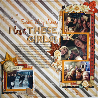
When I ordered the Crate Paper Oasis Collection, I knew I wanted to use this piece of paper for these particular photos.


Without thinking about it, I used the wave side for this this layout.  I thought I had ordered two pieces.  Argh!  I was really sold on using this paper, so I took a piece of white cardstock, painted it with gesso and started applying some Distress Oxide Inks to create my own ombre effect background.  Unfortunately, I only have a few colours of oxide inks, so to fill in some colour gaps, I used some water colour paints. The photo doesn't do the paper justice, (the lighting is yucky) but I'm really happy with how it turned out.


To scrap the rest of the page, I kept it pretty simple. The flowers are fussy cut from another Oasis patterned paper. I used some vellum strips for my journaling because I didn't want to cover up the pretty background.

Now, on to the exciting news! I'm happy to announce that I have been chosen to be on the Scrap Shotz design team!  It's been quite a while since I was on a design team and I'm really looking forward to it. I subscribed to their kit a couple of years ago and I loved them.  For more information on Scrap Shotz, the kits and the new design team, check out their blog at http://scrapshotz.blogspot.ca/.

Thanks for looking!
Sylvie


August 4, 2017

Paradise Found

Hi there!

Today, I'm sharing a layout using a lovely cutfile from Paper Issues. I just love their free cutfiles and this summer they have made so many tropical themed ones that I will be using them a lot in this album.


When I started this album, one of my plan was to use the Crate Paper Oasis and line with bits of old beach collections from Fancy Pants. The background paper is the b-side from Beach Bum made in 2010.  The colour matches perfectly to the ocean in my photo (at least it does in real life).

I used the brown b-side from another piece to cut the palm trees. The "palms" are from a 6x6 pad of Oasis and scrap pieces of Fancy Pants from Down by the Shore and Beach Babe. I fussy cut the hibiscus flowers from Down by the Shore and embellished with some Oasis die cuts.  Because of the big palm trees, I didn't really feel the need to add too many embellishments.

The title is another Paper Issues die cut.  Once cut and adhered to the page, I covered the entire title with Nuvo Crystal Drops.  I used to do this technique with Glossy Accents but the Crystal Drops have a lot more dimension when they dry.  I put a few on the page like they were enamel dots and in really  life they add a great texture.  Great.  Now I want them in every colour!!

I just love this page! And I'm so happy to be using us some older supplies.

Thanks for looking!
Sylvie

July 29, 2017

In The Beautiful Sunshine With You

Hi there!

I've been using a lot of sketches lately.  I find that when I don't have a lot of time to scrapbook, a sketch gives me a great starting off point.  Throw in a process video from Shimelle Laine using a sketch and I am inspired!


Almost everything here is from Crate Paper Oasis, but there is some unknown washi tape,  rhinestones and a very old sun stamp from Fancy Pants that I stamped and then fussy cut.

Doing a scrapbook page at an angle is something out of the ordinary for me, but I really like this page.  It's pretty simple but because of the angle, I think it gives a nice punch that doesn't really need more embellishment. I just love how it worked out.

Thanks for looking!
Sylvie

July 22, 2017

Oh Happy Day

Hi there!

Today I'm sharing a layout inspired by the Creative Scrapbooker Magazine July sketch and Shimelle Laine's 25 Scrapbooking Words challenge.


While I love the Crate Paper Oasis collection, these cut apart cards frustrate me a bit. I liked cutapart cards when you could use them for journaling.  Now, manufacturers make them as embellishments with no room to journal and I have a difficult time using them.

When I saw the sketch, I had the idea to use the cards instead of a photo or patterned paper for the squares. I was able to stick pretty closely to the sketch, which is something I usually have difficulty doing.

Shimelle's challenge was to use the title "Oh Happy Day". It was perfect for this photo, as this was our first morning in Cuba and it just so happened to be my husband's 50th Birthday!

I was able to mix and match supplies from Oasis and Bloom collections. The cactus, leaf, pineapple, sun and palm tree are all die cuts using metal dies from Peach Cheap.  Aren't they cute? To give them a bit of pizzazz, I covered them in Wink of Stella glitter. The background paper was made using my new Tim Holtz Distress Oxide inks in Broken China, Fossilized Amber and Worn Lipstick.  Those three colours work beautifully with the Oasis collection. I outlined all the cards, the photo mats and the white cardstock with a black pen to give them definition. To finish everything off, I added some old My Mind's Eye enamel dots and some machine stitching.

I apologize for the darkness of the photo. It's not as dark in real life. My camera settings must off and I couldn't fix it in Photoshop. And it doesn't look as crooked in real life.  lol!

Thanks for looking!
Sylvie